Autumn Advances
by Zyrn
In the past month I have been reasonably busy, so I didn't start a new project for once, and instead I just worked on my website a bit more. Most of my work revolved around refining what I already had and improving the development workflow further.
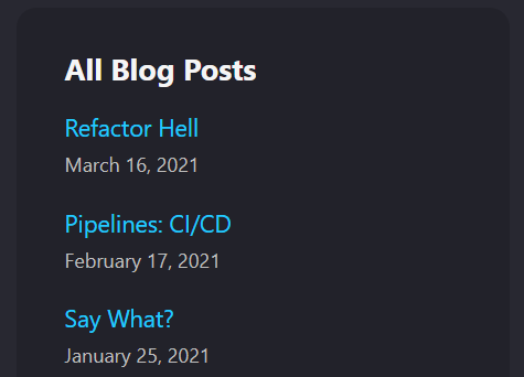
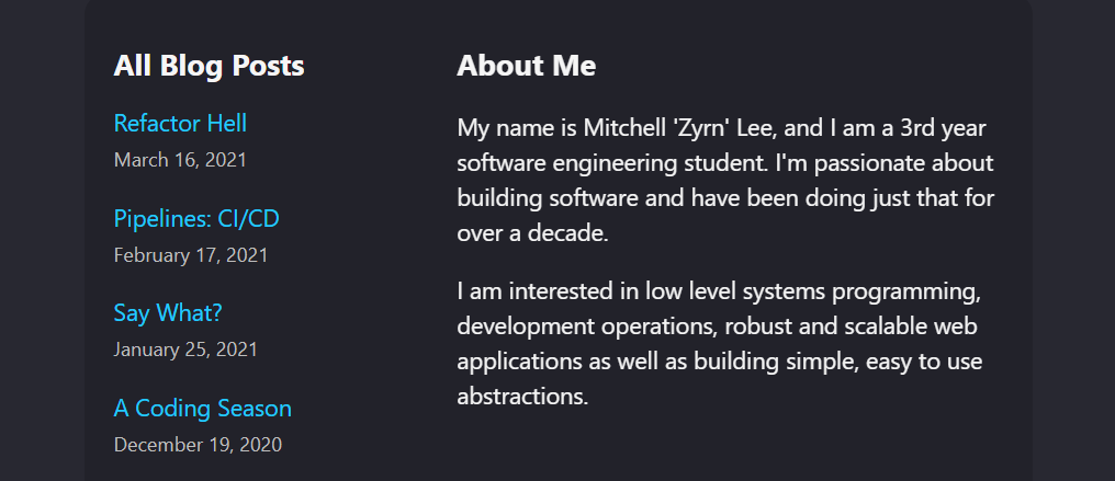
The first thing I targeted was responsiveness of the website. This was important as the old design was created with a mobile first-approach, but since the website wasn't responsive this didn't look good on desktop. So, I started by making the website responsive, with a clear separate layout for the desktop version. I achieved this by using react-responsive which allows you to use CSS media queries as React.js hooks which I implemented in two different ways. Firstly, this method (inspired by Ben Awad's DogeHouse) allowed me display extra content in a second column if the viewport was large enough. Secondly, I reduced the width of page content relative to the viewport when the viewport was larger.


The next major component I worked on was setting up a staging site. This was motivated by my desire to allow some of my friends to give feedback on some of my changes, before I pushed the code to production without requiring them to setup a development environment. To do this I added a staging/development CI/CD pipeline to deploy code to a staging site.
While I was already updating the workflows for this project, I added automated builds & testing on all branches that didn't already have it. However, this process tended to be a bit too slow for a TDD Red, Green, Refactor approach, so I added dependency caching to the build process. This allowed me to build the faster, more reliable, and consistent code.

Until next time, happy coding!